KeyCap Case Study
My Role
Solo Student project for Springboard UI/UX Design Bootcamp
Timeline
September 2022 - April 2023 (7 months)
Problem
People are not aware of the comfort and freedom they can have on their keyboard
As a former leasing agent and programmer, I’ve always considered different ways to type and achieve my goal comfortably. Yet, I’ve seen many people not knowing their options and their freedom regarding the topic of physical keyboards. So the question arises, why is there such a low percentage of people knowing about custom keyboards?
Solution
Open accessibility
White paper Research
A way to achieve more productivity in the workplace
While exploring different topics for my white research paper, I was able to extract a very interesting article from Synctronics.
“Color or graphics make it easier for anyone to identify and remember the most commonly used keys in their tasks. This helps employees locate "hot keys" or combinations of keystrokes that are used as shortcuts.”
Competitive ANALYSIS + GAP
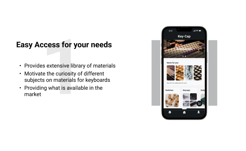
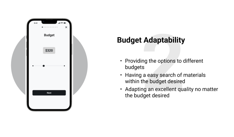
The competition had NO EASY ACCESS or ADAPTABILITY IN BUDGET
While searching and comparing statistics on this area, I analyzed 3 of the most popular websites for keyboards. I found that most of the websites did not have a very good variety of beginner-friendly inventory or had any keyboards below $100. This became a great opportunity for a solution and it was a greater opportunity since they did not have an application available.
User interviews
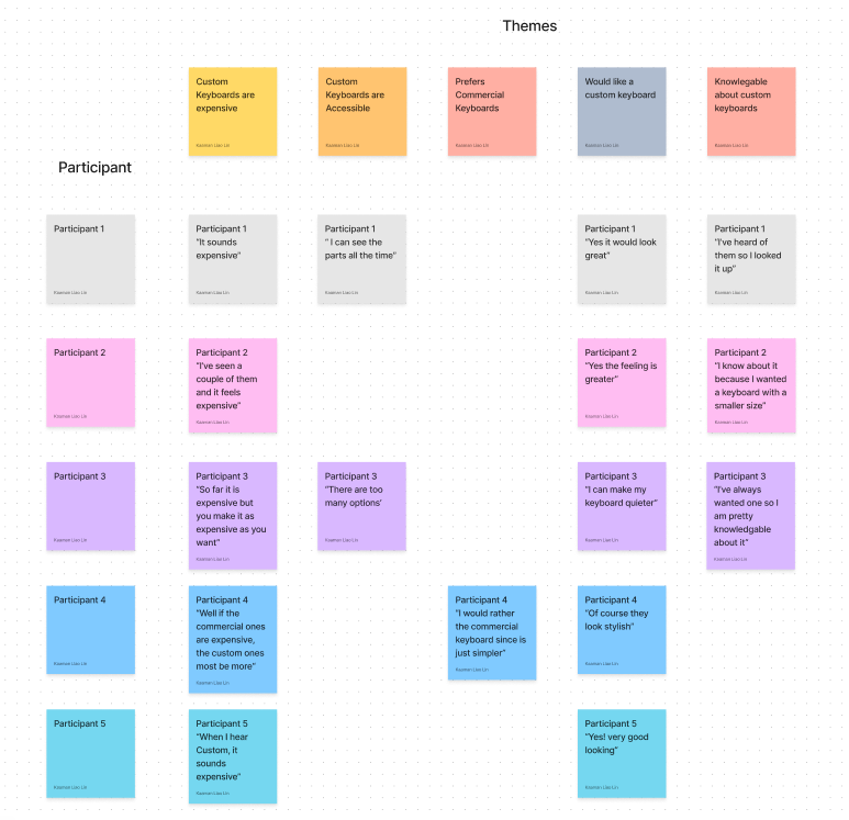
My interviewees wanted to get custom keyboards after they were given more accessible information.
Research questions:
Do you think custom keyboards are expensive?
How easy do you think keyboard parts are easy to find?
Do you feel comfortable with your commercial keyboard?
Would consider obtaining a custom keyboard?
How do you feel about creating your own keyboard?
Main Insight
None of my interviewees used the previous sites due to the lack of information and not being very user-friendly.
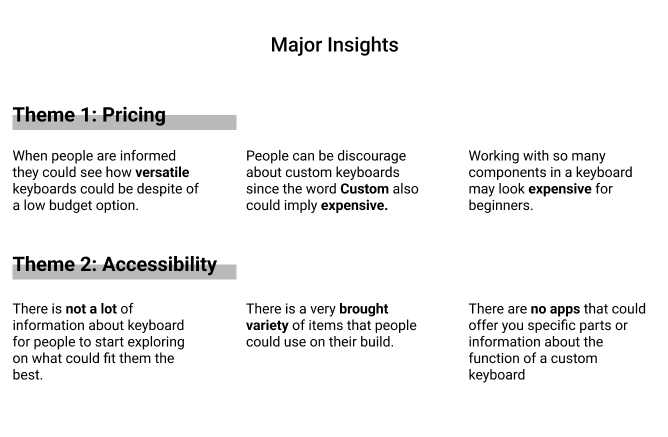
Based on my affinity map, I’ve noticed most people do not know about different options on keyboards and if there is some type of knowledge on it, no one knows about the different ranges of pricing and how affordable keyboards can be.
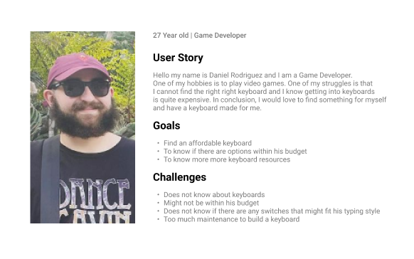
Persona
Design
New directions for customizability
At the beginning of the project, I wondered about what could be something that is used every day and that could be personalized to someone in particular. At first, first I thought of architectural customization, glass builds, and car customization. In the end, I wanted to start with something that was easily missable yes crucial for our everyday use, and is your very own keyboard.
Testing + Improvements
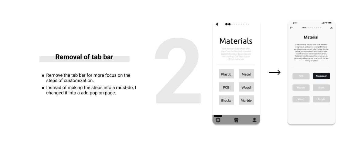
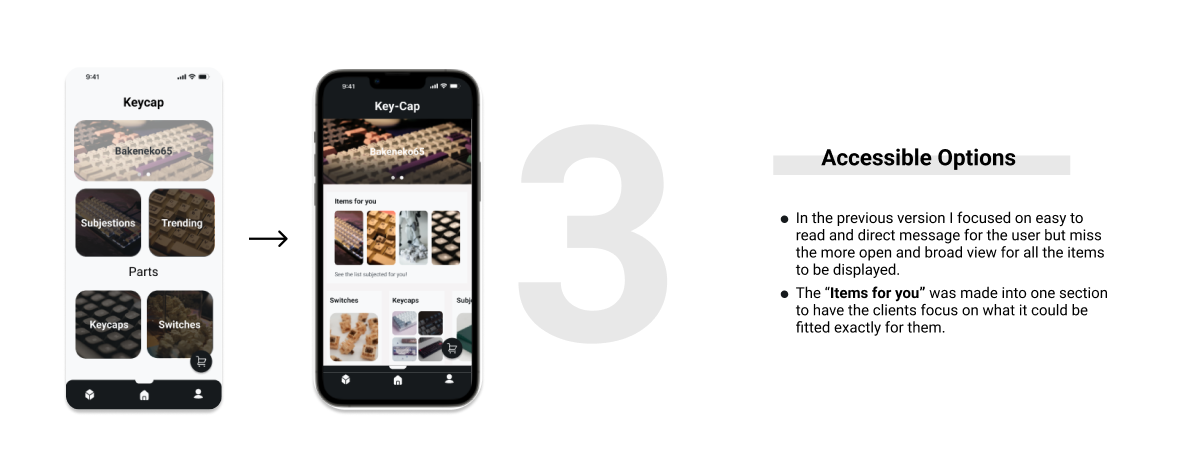
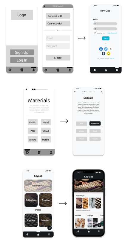
3 Essential Improvements
In the process of this, I got to feedback from over 10+ people and my mentor. I worked on the design in the span of 2 months and was able to identify 3 major improvements:
Comparison
Before and after results
During the initial testing of the prototypes, I noticed some of the challenges in my design. However, after correcting the big stops, I saw an improvement of 80% of the navigation.
Before
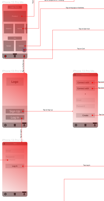
At the start of the Menu, the testers would get confused about what was going on. The options within this main menu were ambiguous and could not clarify what to do, whether it would be sliding, pressing or what was the exact category.
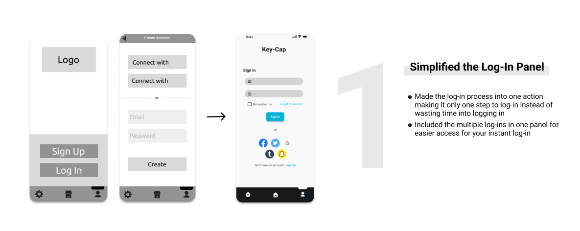
After the main menu and going forward to the log-in option, it was just too long. Something that was very important during the process was making the log-in process as simple as possible, however, making the log-in with extra steps and also not being able to clarify the options on the panels made the process very difficult, making the testers stop and wonder in the area for a total of 10 seconds. Making the success rate 3 out of 5.
After
After the improvements and notes were taken, people were able to figure out the order and the function of each panel. As the previous section said, I was able to make improvements on the design making it shorter and easier to understand. The testers were able to identify the function and spent 2-4 sec for each panel. The success rate increase to 5 out of 5 people understanding and completing the task.
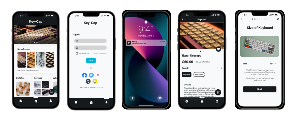
Final Screens
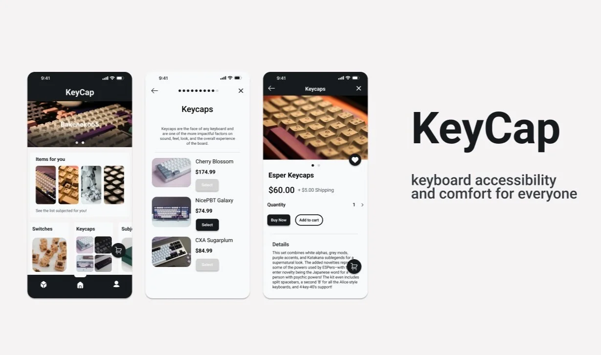
The Final Product
Created with figma
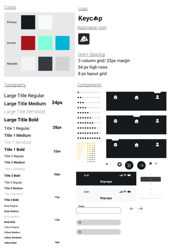
Style Guide
Conclusion + Lessons Learned
What I would do differently next time.
As my first-time experience doing a UI/UX project, I am extremely grateful for going through this entire project and being able to learn many lessons for my future projects. On that account, here are a few points that I’ve learned:
Understanding UX. At the beginning of the project, I struggled with keeping my designs useable and understandable. I was so focused on “how my designs would look” instead of focusing on “how can the users understand my designs”. In addition, the questions that I could’ve done was, how can my users understand and yet be attracted by the designs?
Look at different structures. While I was collecting ideas for this project, I could not figure out how to introduce this customization system into the retail market without completely taking away the goal of the app that was customizing your own keyboard. Then I realize, instead of thinking of it as an only E-commerce app, I could’ve put into account more features of other types of application like dating apps, restaurants apps, transportation apps and the features of clothing brands that help you choose the perfect size for you.
Focus on simplicity. Something I always say is “Less is more”. When I was doing this project I had a bad habit on making extra steps in order to get to the final steps. A perfect example would with the log-in page, in the startup phases of this project I added a “log-in” button to then go to the next page to input your information.
