Capstone 2: E-Commerce - Sparrow
Timeline
May 2023 (90 Hours)
My Role
Student UI/UX Designer
Task
User research, Competition analysis, style guide, User flow, High Fidelity mockups, User Testing
PROBLEM
Difficult Process
Your PM has shared data that shows 50% of users open on average 7 item pages and then abandon the site without moving any items into the cart. Your PM’s hypothesis is that users cannot determine which bike is best based on relative features.
Additionally, 70% of users who place an item in the cart do not purchase it. Data shows that users abandon the cart at the registration page. Right now, users must make an account to purchase. Your PM wants you to design a guest checkout to solve this. The guest checkout must capture email.
Solution
Simplify
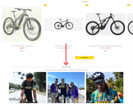
After revising the problems of the brand, I came to the conclusion that the lack of items not being put into the cart might be because of the lack of description and focus on the product. For this topic, I would love to implement and change of color to focus on the products and add a description setting with a comparison box to show the users the different options provided on other pages.
The 70% of users not purchasing the items, might be because of the extensive process of checkout. So trying to simplify the process and also having an option for guest checkout should be a great start for new people.
Competitive analisys +gap
Study Industry Leaders: Trek Bikes, City Bikes, Mack Cycles
After looking through other sites and comparing the different features that each provided, each of them provided a certain amount of interaction and fast engagement that increases the user's attention towards specific products.
City Bikes
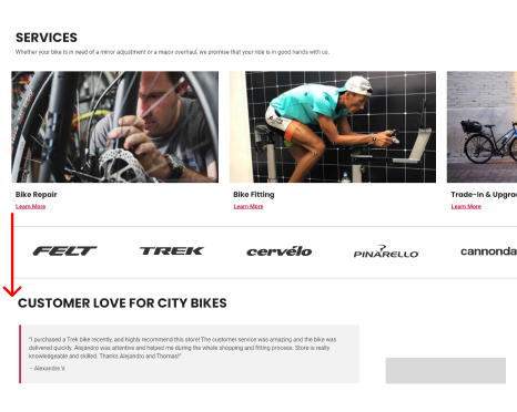
On the City Bikes website, after scrolling down through their bike sales section, they implemented a direct comment section to show the reliability of their product and show direct comments from customers that have acquired their products before.
Link: https://www.citybikesonline.com/
Trek Bikes
On the Trek Bikes website, after the main advertisements and scrolling down, Trek implemented a fast interaction and direct guide to the bikes they provide. Knowing the bike community and the incentive of a welcoming atmosphere encourages the user to look at the different options of bikes and also know the community and the area where they are located.
Link: https://www.trekbikes.com/us/en_US/
Mack Cycle
On the Mack Cycle website, similar to City Bikes, after scrolling down through the bike sales, you will see a section for their community riding. Every Monday Mack Cycle organizes a whole peloton to ride through Key Biscayne. Inviting the users to a more human and interactive scenario with other people encourages them to be included on any bike at whatever price.
Link: https://mackcycle.com/
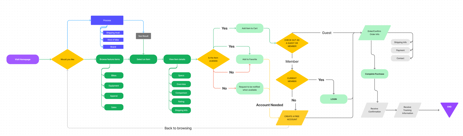
User Flow
Map
On this user flow, I wanted to check different websites to understand the process of why big companies have their returning customers and why do they keep shopping online.
Testing phase
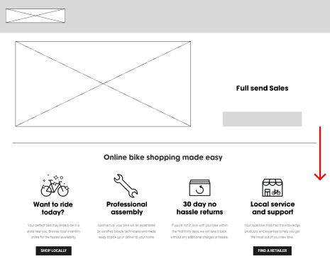
Low-Fidelity
Once I checked other competitors' usability, I began sketching the layout for my bike website. I had identified a couple of issues within the design, one of the main issues of the company was the complicated checkout methods and how long the clients would leave their product in the cart without completely checking out.
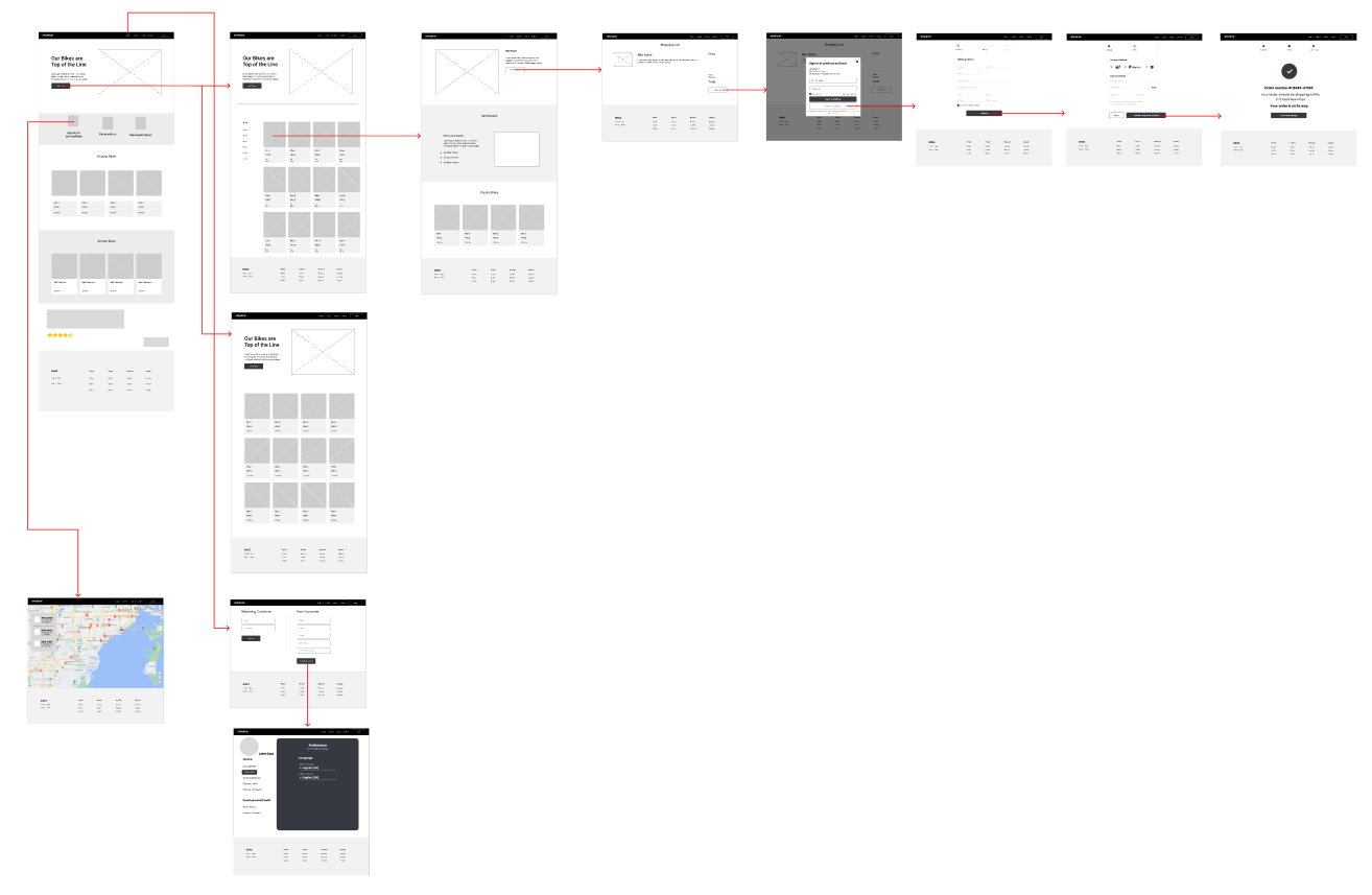
Usability Test - Low-Fidelity Wireframe
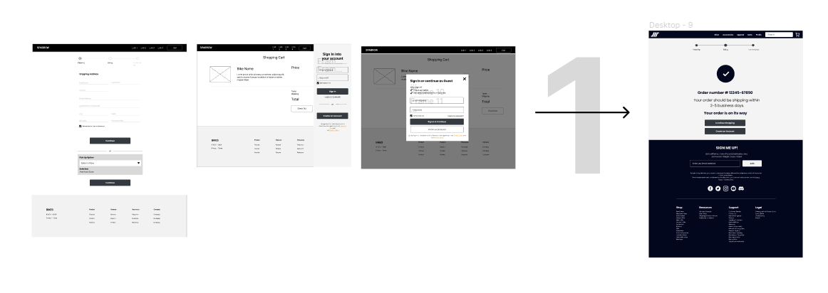
I conducted the first round of the usability test on the lo-fi wireframe of Sparrow. The purpose of this test is to discover issues with the design and see how the personas would interact with the design. I had 3 different ways for users to make an account and to also combine it with the checkout process.
I conducted the test on 5 enthusiastic people about cycling, and their feedback about the website was very different but they all focused on the checkout and I got to discover a couple of things:

Improvement Phase
3 Essential Improvements
After the previous interview, I wanted to improve upon some of the subjects that weren’t even mentioned to them. A couple of people were also mentioning that even with some of the bike manufacturers, did not even offer a direct purchase site but instead other vendors.
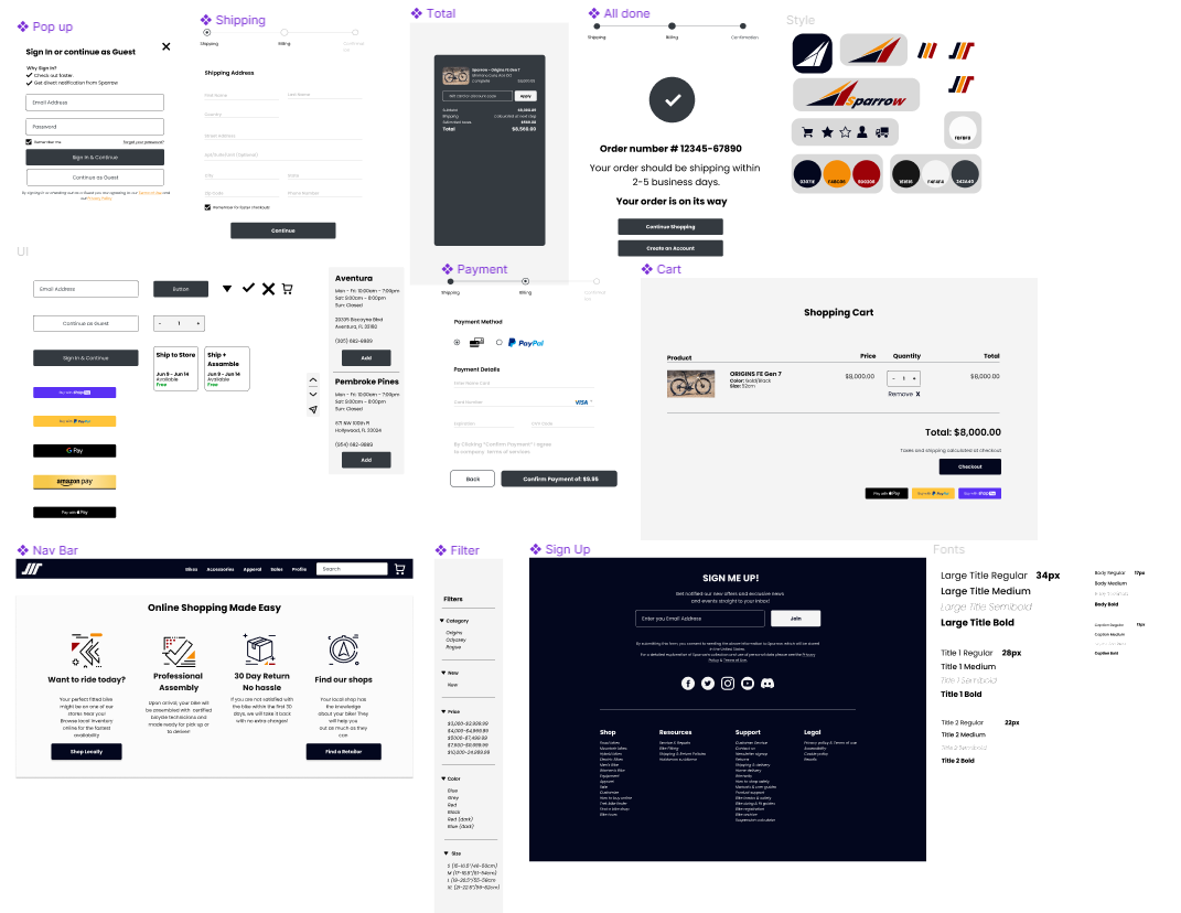
2. Total
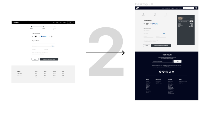
The beginning phase of the I wanted to make each section of the checkout to be their own but I felt that the total could be something that could keep track of the users purchase.
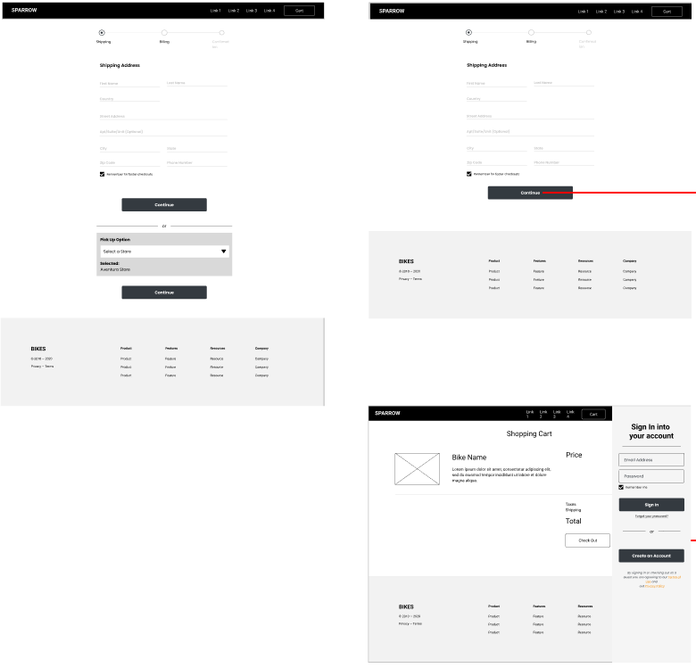
1. Simplicity
From the 3 different ways that I implemented before, I combined them into one simple process. I made the divisive checkout and account creation into a convenient way to be on the more optional side but at the same time to give power to the client.
3. Description
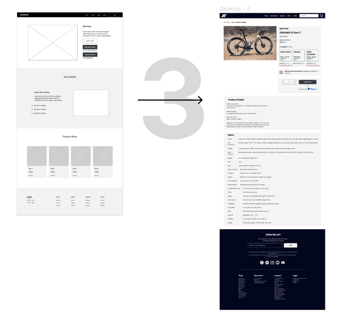
On the first design, I thought of putting suggestions and wanted to add more to the description of the product.
Comparison
Before vs After Results
Before
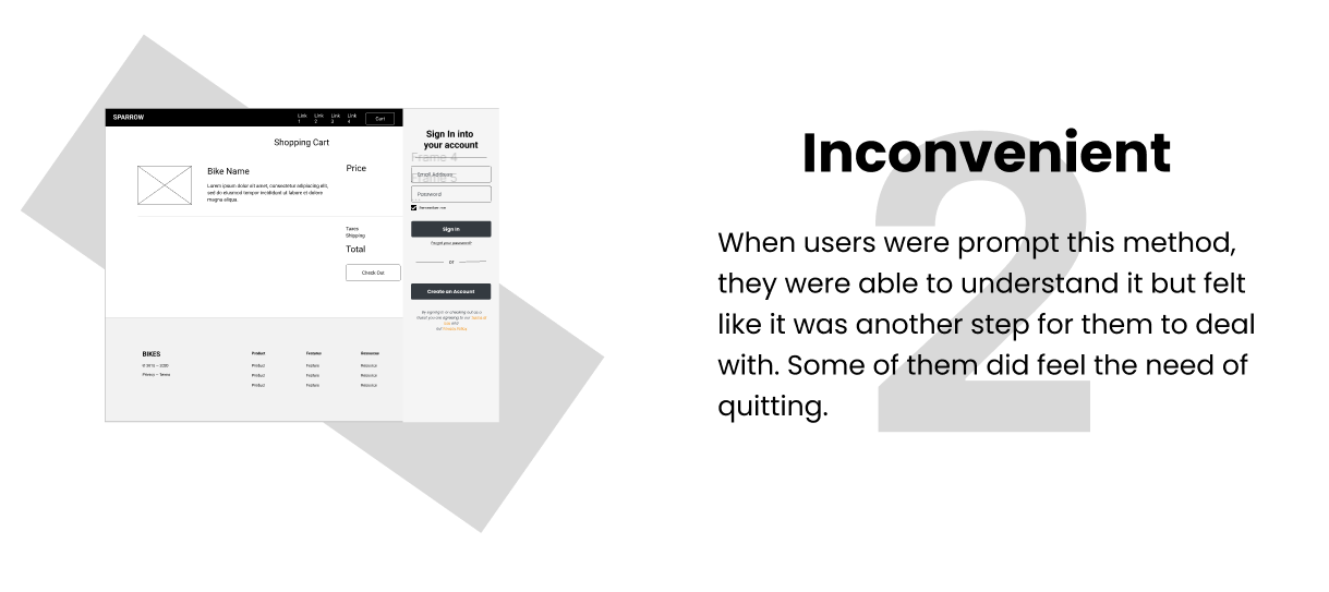
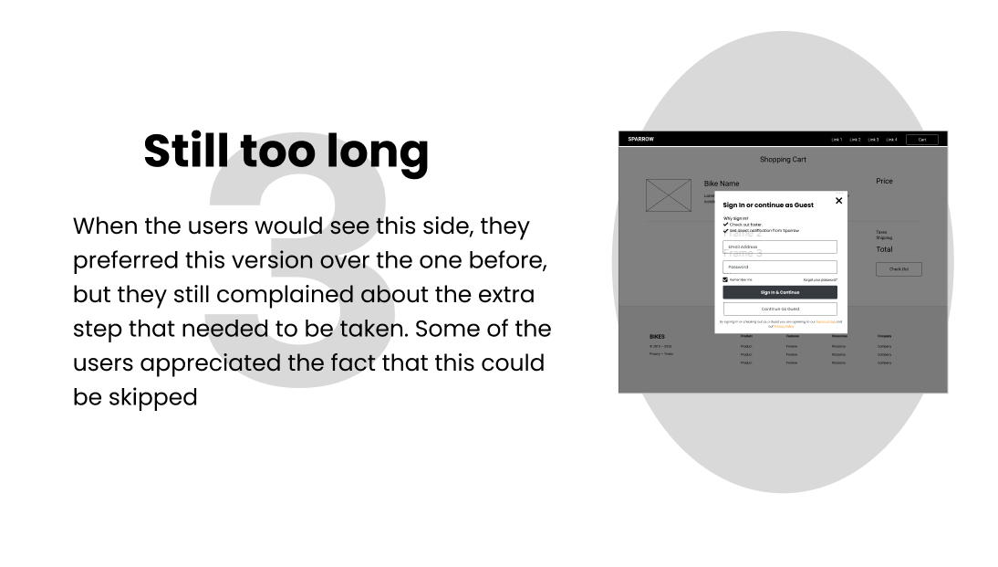
In the original design, one of the main concerns was the checkout section. Using mainstream checkout systems like Walmart, Target or HomeDepot could not work since it had a bigger returning clientele. When I tried each method with the testers, they were able to understand it but would ask me “Why is it so complicated?”. The motivation and convenience of finishing the checkout, decreased drastically making people spend almost a minute to finish everything. By looking at this process I had 3 testers change to other ways before finishing. The success rate of this test was 2 out of 5.
Another concern for the test was the map option to locate a store near you. Testers were confused as to why they weren’t able to have the option for them to see where they go to try a bike in person. As a cyclist, I understood where this was coming from since bikes were like clothes, is better to go try them in person instead of getting one online.
After
After some modifications and corrections, I was able to simplify the checkout process and add the map option for people to pick up and assemble. In this new test, I had to do some testing on 10 people, 5 who were not cyclists and 5 who were cyclists. The first 5 testers, were able to go through the prototype perfectly without any problems increasing the rate to 5 out of 5. And for the 5 cyclists, were able to understand and also appreciated the fact that their needs were satisfied, during the rundown for the prototype, they were able to understand increasing the results to 5 out of 5.
Final Screening
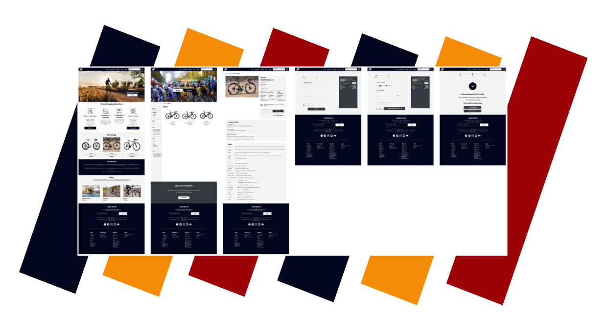
The Final Product
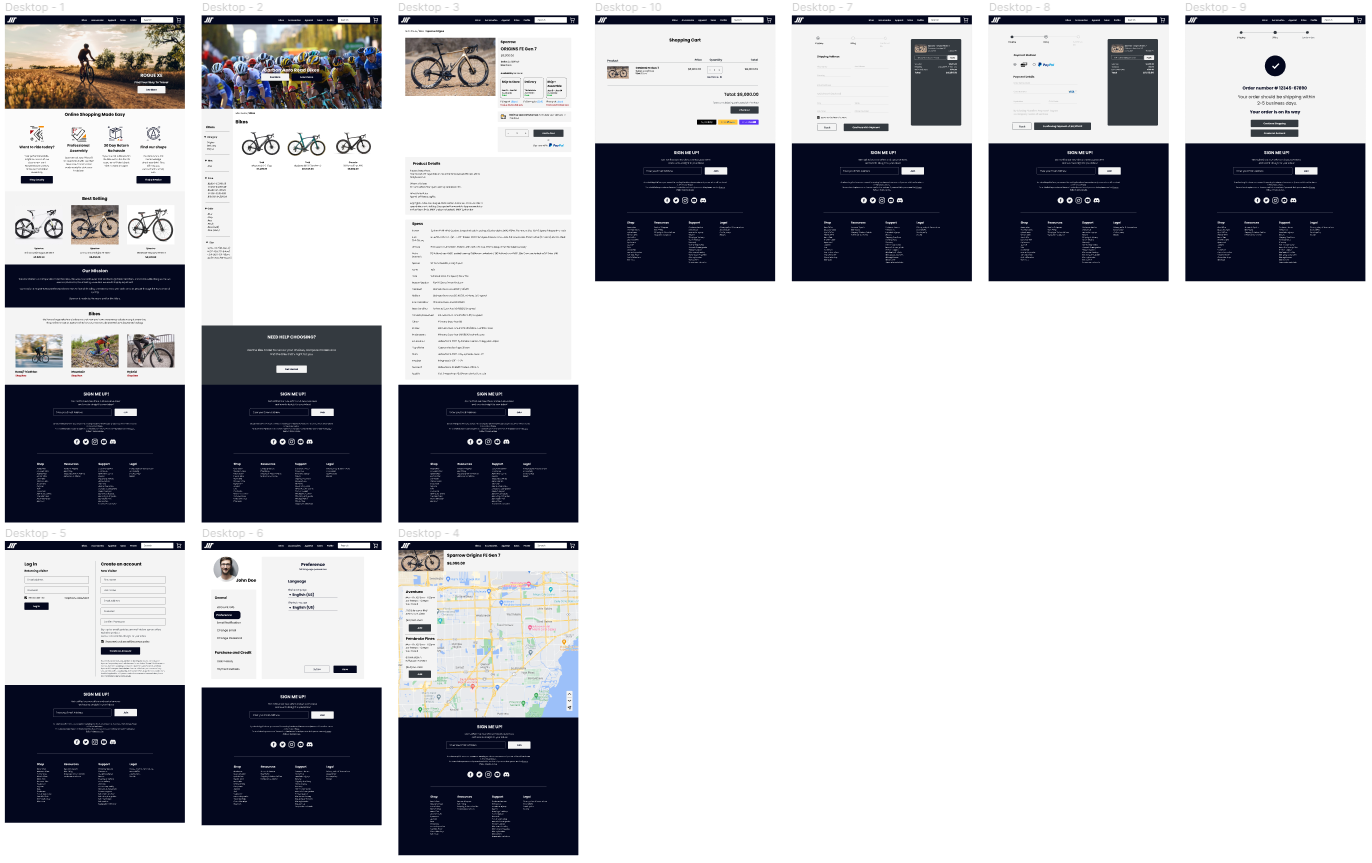
Created with Figma
Style Guide
Conclusion + Lessons learned
Struggles and Lessons
While still learning about UI/UX, I got to implement a couple of stuff that I have learned from my first capstone. Even with the experience, I let myself have some time away from this project so I get to see my own creation from a different perspective. On that account, here are a few points that I have learned:
Simplicity. While I was reading one of the issues on the website, the checkout process is too much of a hassle, making it very inconvenient for the user but also in addition to that, the users were not engaging, and they not making an account to the website. So my thought process was, how do I make it both convenient and easy to process? This was one of the struggles I went through the most. During this process, I was able to implement an easy-to-process checkout while giving the user an easier checkout the next time they made an account with all the information they provided in the checkout section.
Reaching out. Something that I always forget about in this project is that I could reach out for help. In this capstone, I had to remember I could ask my mentor to help me with a different point of view. His experience in this field gave me a great insight into what I could do by learning from other businesses. I was able to implement features into the website from other companies like Home Depot.
Understanding. From the beginning of the capstone, one of my mistakes was to only see everything one-sided. I had to understand the UX section of this capstone, so reaching out to my mentor helped a lot, he told me that I had to understand why people would give up on a site or make them feel annoyed while they use it. With this information, I went on different sites and competitors and see why it would be annoying to purchase an item on their site. One of the examples was Walmart and Target. I understood that the previous websites were on a different scale in comparison to a bike-focused website, but I wanted to be strict and highly critical to cover up as much ground on the matter as possible.